
Record warmth
It took 90 years but the U.S. finally had a month that beat July 1936 for warmest month on record. This was more of a technicality than a full scale thumping of an old record. In Nebraska July 2026 was tied for 17th warmest and was well short of July 1936, which hasn't been seriously threatened since then. Nevertheless, the old Dust Bowl records for nationwide temperatures are starting to fall and unlike July 1936, this wasn't achieved by an historic heat wave where 13 states set all-time record temperatures. This was due to a majority of the country (outside a few spots in Texas and the northeast) of being well-above average, especially at night.
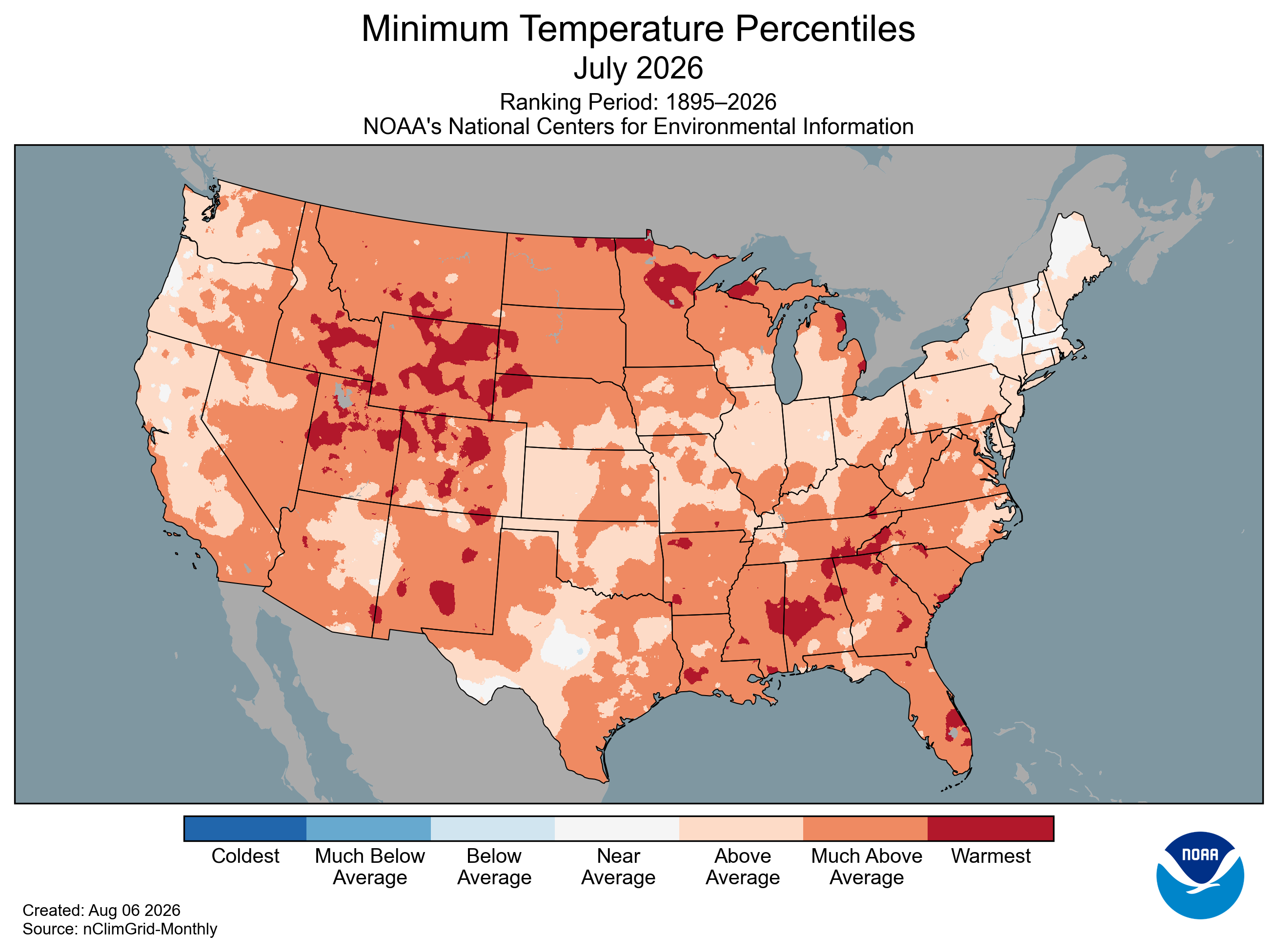
Figure 1. July 2026 Minimum temperature percentiles
1936 vs. 2026
If we look at global temperatures from July 1936 to July 2026 (Figures 2a-b), we do see some similarities. Both years featured large areas of the Northern Hemisphere with intense heat. The north central section of the U.S. and eastern Europe were well above the averages of the second half of the 20th century and more so than this July. But there were many areas that were also cooler than average in July 1936, including much of Texas and the southwestern U.S. A look at global temperature anomalies this year reveals a planet that has a lot of warm anomalies with only pockets of cooler than average temperatures. Warmth was most exceptional in western Europe, the western U.S., and northern Canada.
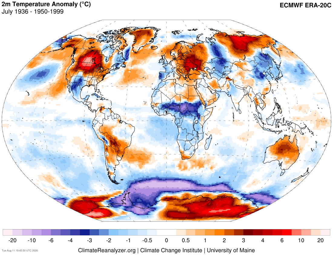
Figure 2a. Temperature anomalies in July 1936 from the ERA 20th century reanalysis dataset
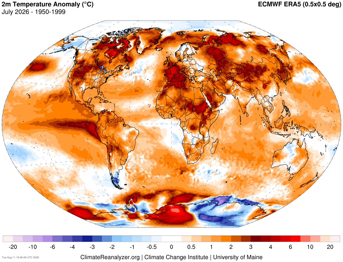
Figure 2b. Temperature anomalies in July 2026 from ERA5
Moist air harder to cool off
The strong El Nino that has developed rapidly over the last several months is surely responsible for some of the enhanced warming. Over the last few months the global temperatures have separated from last year and are essentially identical to 2023 and 2024, the former was also a developing El Nino. The extra release of latent heat (a warming process) from the warmer eastern tropical Pacific has led to much warmer than average temperatures in the areas with the warmest water relative to average.

Figure 3. Global temperatures compared to past years
One of the primary consequences of a warming planet is that it can hold more water vapor. It is fundamentally harder to cool off moist air than dry air, which is a key reason that our minimum temperatures were so consistently above average around the U.S. this summer and pretty much every summer in the last few decades. Widespread cooler mornings in the U.S. in the summer is mostly something that is in the rear view mirror.
A look at dewpoints in Figure 4 helps tell the story. Quick refresher- dew point is the temperature at which condensation would form. Higher dew points are a reflection of a more moist air mass. This can keep maximum temperatures from reaching extreme levels (see figure at the top of the story) but it also helps reduce radiational cooling that allows for nights to offer more comfort. The dewpoints are above the second half of the 20th century average for a majority of the planet, with enhanced positive anomalies for most of the U.S. east of the Rockies. This is also a reflection of the very warm ocean temperatures, especially the Gulf, and the southerly flow from it. Dew points were lower than average in western Europe but that is because of the intense drought conditions prevalent over there right now. We saw similar dew point anomalies in the central U.S. during the massive droughts of 2012 and 1988 for example.
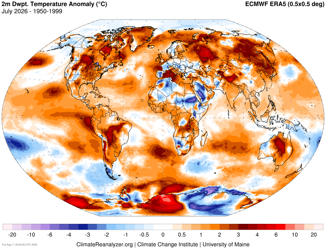
Figure 4. July 2026 dew point anomalies
Jet stream differences
Another consequence of a warmer planet and warmer higher latitudes is a weaker and more poleward jet stream than say 40-50 years ago, even in hot U.S. summers. For example, July 1980 is still among the warmest July's on record for the U.S. and was hellishly hot in much of the south central U.S. But a look at the average jet stream in July 1980 reveals more zonal flow in the mid-latitudes with peak winds around the U.S.-Canadian border and into southern Europe. Areas to the south would have been very warm and areas north would be cooler.
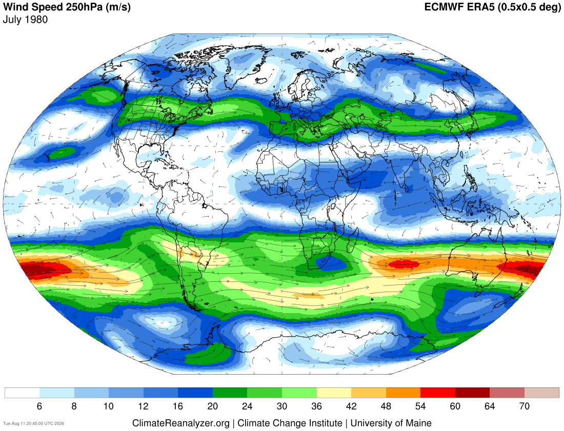
Figure 5. Jet stream (250-mb) winds in July 1980
A comparison with July 2026 shows more amplified/less zonal flow than in 1980, generally further north, and with weaker winds due to a weaker temperature gradient. Patterns like this are going to allow for some places to have significant drought and heat while other places get repeated storms/heavy rain. Not every single July going forward will look like this. But it is a taste of what will be more common, if not the rule in mid-summer in the not too distant future.

Figure 6. Jet stream (250-mb) winds in July 2026


